
What Are You Looking For?
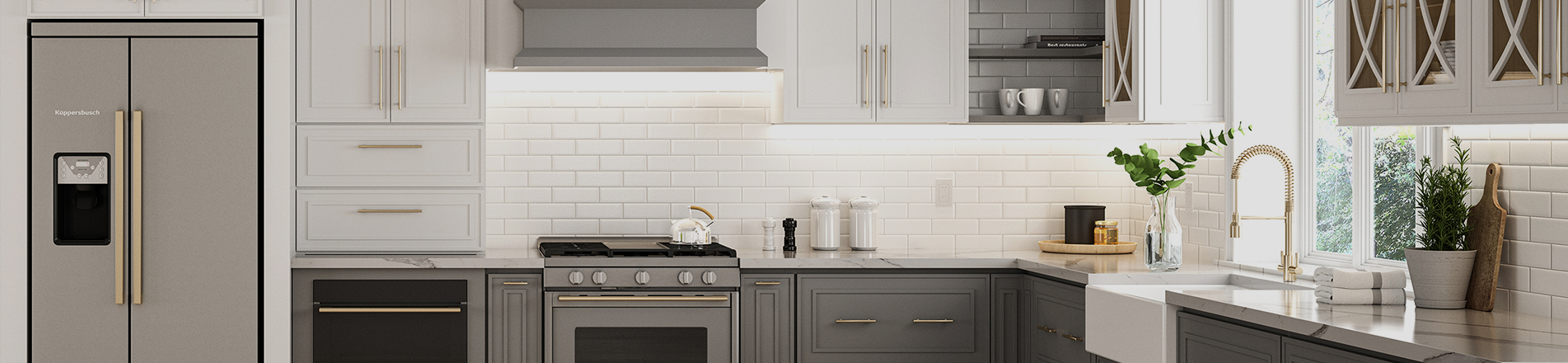
Many people feel that kitchens with only one color look monotonous nowadays. If you want to add depth, character and design appeal to your kitchen, two-tone kitchen cabinets are the most reliable option. Compared with cabinets in three or more colors, they also look cleaner and more timeless.
While two-tone kitchen cabinets create a unique look through color pairing, poor color coordination will make the whole space feel disjointed. Only with well-matched colors can the kitchen instantly achieve a custom, high-end feel. Therefore, if you plan for a two-tone kitchen, it is essential to understand the rules for two-tone kitchen cabinets.
1. Understand the Definition of Two-Tone Cabinets
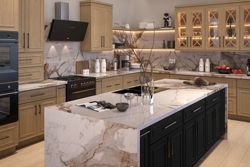
Two-tone kitchen cabinets refer to cabinetry finished in two distinct colors or textures instead of a single shade. Color blocking can be vertical (upper cabinets vs lower cabinets), horizontal (perimeter cabinets vs kitchen island), or component-based: cabinet boxes vs open shelving, range hood covers, or an accent cabinet wall.
It does not mean an overly colorful kitchen. Most attractive two-tone mixed-color wood kitchen cabinets fall within neutral tones: pure white, off-white, greige, sage green, navy blue, charcoal gray and natural wood. Contrast comes from value (lightness and darkness) and color temperature, rather than pairing two highly saturated, clashing hues.
2. Follow the Golden Ratio Rule
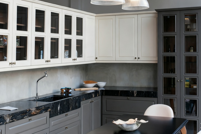
The first rule for two-tone kitchen cabinets is to follow the classic 60:30:10 golden ratio for color distribution. This fundamental formula keeps the two-tone scheme balanced and ensures visual harmony throughout the space.
Breaking this ratio — for example, splitting two high-saturation colors 50/50 without neutral buffer tones — will result in a busy space with no clear visual focal point. One color must clearly be the dominant shade.
3. Vertical Layout Principle: Dark Bottom, Light Top
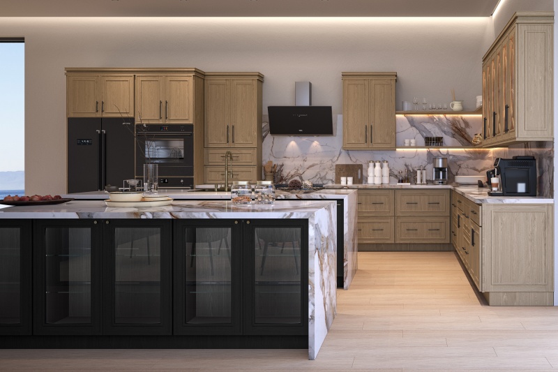
The second rule for two-tone kitchen cabinets is the dark-bottom-light-top layout. This is the most widely adopted and practical layout guideline, rooted in human visual perception rather than fleeting design trends. Light shades for upper cabinets and dark shades for base cabinets create a light upper section and a grounded lower section, keeping the kitchen bright without a top-heavy appearance.
People naturally view a space from bottom to top. Placing darker, visually heavier finishes on base cabinets and lighter finishes on wall cabinets aligns with natural visual logic. The popular black and white American style framed kitchen cabinets follow this principle to create a grounded, stable space and visually raise ceiling height. It also brings practical benefits: base cabinets endure more daily wear, and darker finishes hide scratches, fingerprints and water stains much better.
When can you reverse it (dark uppers, light lowers)?
A reversed layout is possible but only works under limited circumstances:
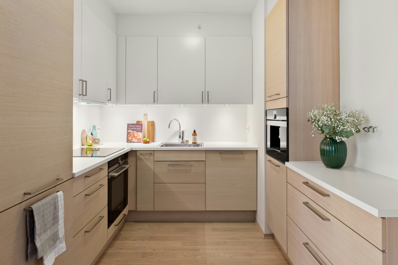
4. Color Matching Strategies
For a timeless, pleasing result, follow these three strategies to maximize the beauty of two-tone kitchen cabinets, giving your kitchen rich layers and sophisticated style.
1. Same Hue, Different Values
Pick shades from the same color family and separate them only by lightness. Warm off-white uppers paired with greige base cabinets; pale sage green uppers matched with deep forest green island cabinetry. Consistent undertones deliver elegant, cohesive contrast with minimal risk — the top choice for beginners.
2. Painted Neutral + Natural Wood Veneer
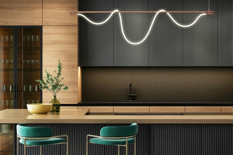
This is the most popular modern two-tone combination: perimeter cabinets in painted neutral colors, while the island or base cabinets feature natural wood veneer. Two-tone kitchen cabinets in brown and white are a classic harmonious example. Wood adds warmth to cool painted finishes and vice versa. A key note: the undertone of the wood must match the undertone of the paint. Warm oak pairs with warm white (avoid cool blue-toned white); cool light gray works better with wood with minimal yellow undertones.
3. Complementary Neutrals
Pair cool neutrals (pure white, light gray, navy blue) with warm neutrals (greige, oat, light oak). The interplay of warm and cool tones infuses vitality into the space without bright, bold colors. Avoid pairing two cool shades with only subtle lightness difference (bright white uppers + light gray base cabinets). The faint gap may look like a production color error instead of intentional design and ruin the aesthetic.
Color Matching Pitfalls to Avoid
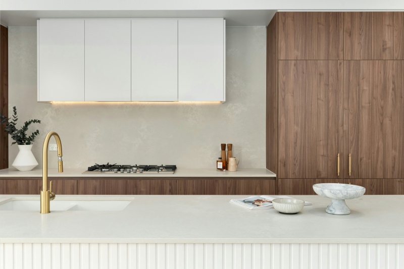
5. Island Accent Scheme: Low-Risk Option
If full-perimeter color blocking feels too bold, designers often recommend this conservative approach: apply the two-tone effect only on the island. Keep all perimeter cabinets in one solid color (mostly white or off-white), and reserve the secondary color (wood tone, navy, charcoal, sage green) exclusively for the island.
This works for three reasons. First, the island becomes a natural focal point. Second, it limits the "risky" color to roughly 25% of the cabinetry, so the commitment is easy to live with. Third, it naturally obeys the 60-30-10 rule without any extra planning. For open-concept homes, this is also the most forgiving approach, because the island visually defines the kitchen zone against the living space.
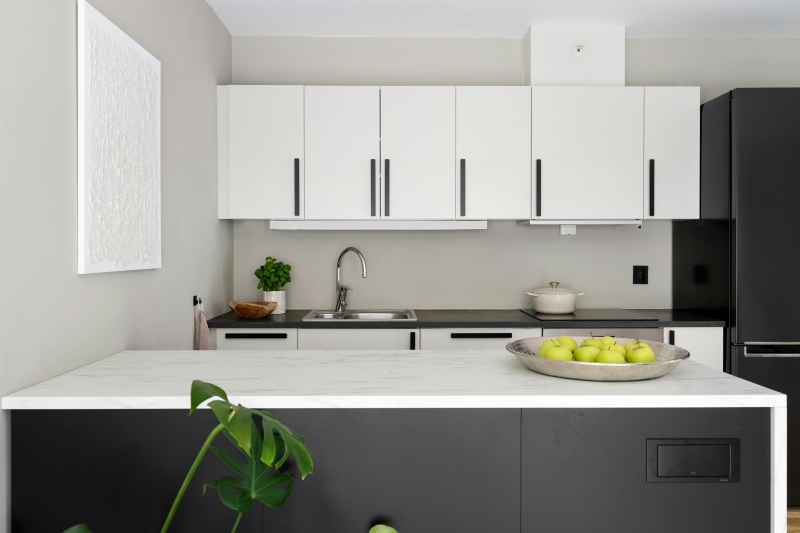
6. Finish and Door Style Specifications
The third rule for two-tone kitchen cabinets covers finish and door standards. Color is only half of the design. The sheen and material of both cabinet sets must be consistent; even with identical color codes, mismatched finishes will look like cabinetry from separate orders.
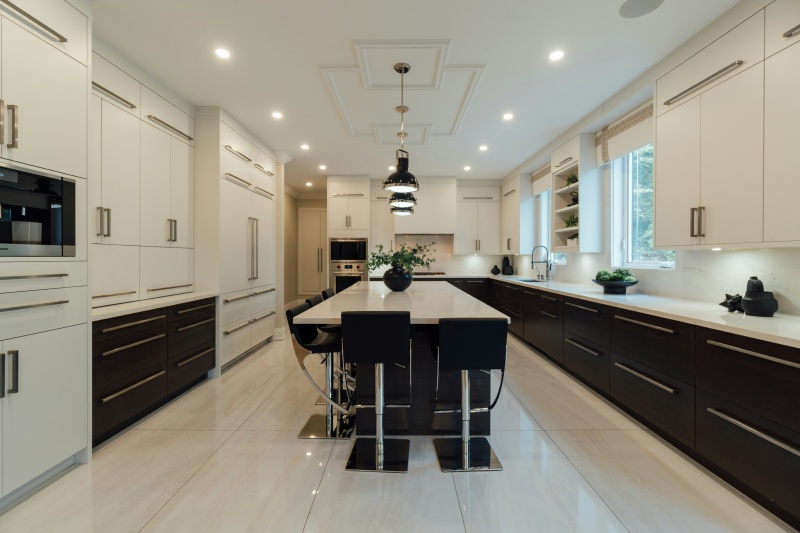
7. Three Transition Elements: Countertop, Backsplash and Hardware
Never overlook countertop, backsplash and hardware selections for two-tone kitchen cabinets. These neutral components act as the bridge that unifies the two cabinet colors.
8. Closing Remarks
The core of two-tone cabinets is not daring color experimentation, but orderly design logic. Featured kitchens in design magazines rarely adopt extreme color choices. They follow the core principles of two-tone kitchen cabinets: the 60-30-10 ratio, dark-bottom-light-top layout and unified hardware. Select one neutral base shade and one contrasting finish, let the countertop and backsplash serve as transitions, and resist the urge to introduce a third color. The final result will be timeless and attractive.
Practical advice for bulk RTA cabinet buyers and trade contractors: use the same door style, substrate and sheen for both colors. Assign dark or wood finishes to base cabinets and islands. Consistent production specifications deliver clean installation and long-lasting appeal.


 Newsletter
 Español

 IPv6 network supported