
What Are You Looking For?
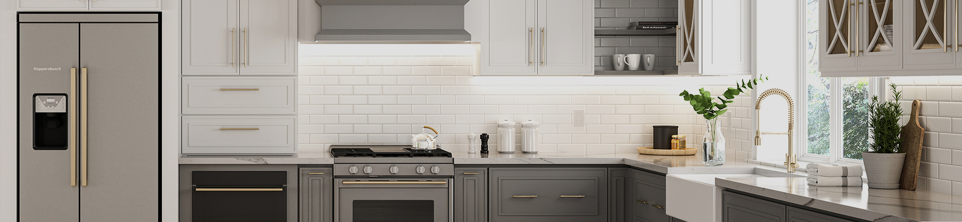
Durable natural light oak framed kitchen cabinetry has become a mainstream choice in modern kitchen design. Boasting warm, natural grain and an airy, lightweight visual effect, it suits a wide range of design styles. Dark wood cabinetry establishes a strong spatial tone, while light wood varieties (including white oak, maple and birch) feature soft grain and low saturation with subtle natural tone variations, leaving ample room for countertop color pairing.
Many homeowners struggle with countertop color selection. A poor choice can easily make the kitchen feel dull, tonally disjointed or visually flat, ruining the delicate natural texture of premium light oak wood kitchen cabinets. Countertop color matching is not merely a matter of personal preference. It requires base color harmony and balanced visual weight to bring out the charm of light wood cabinets and create a high-end, timeless and durable premium kitchen space.
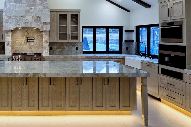
Fundamentals of High-End Countertop Color Pairing
Before deciding what color countertops work best with light wood cabinets, it is essential to master the pairing rules for light wood cabinetry and countertops. All successful combinations are built on these principles, which help avoid basic design mistakes.
1. Prioritize consistent base tones
The biggest pitfall in kitchen color schemes is focusing only on surface hues while ignoring underlying tones. Light wood cabinets fall into two base tone families: warm-toned (maple, alder, light honey oak, with faint yellow and orange undertones); neutral/cool-toned (white oak, birch, light oak, with grey and beige bases and minimal warmth). When selecting countertops, their base tone should align with that of the cabinetry. On this foundation, hue and brightness can be adjusted moderately to add spatial depth.
For example, cool white countertops with blue-grey undertones clash with warm yellow maple slim shaker framed kitchen cabinetry, resulting in chaotic, uncoordinated tones. By contrast, warm cream-white countertops with yellow undertones perfectly echo the warm texture of wooden cabinetry and maintain consistent color throughout the space.
2. Balance visual weight to avoid monotony or clutter
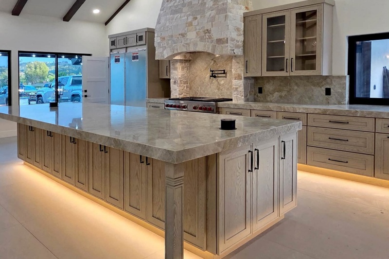
Light wood is a low-saturation, visually lightweight material. Countertops therefore balance the spatial visual perception through color depth and grain complexity. Large areas of pale solid surfaces leave the kitchen lacking dimension and feeling bland. Overly dark or highly saturated countertops, however, overwhelm the airy quality of light wood cabinetry and disrupt the soft spatial atmosphere. A recommended approach is “light base + subtle variation”: use low-saturation neutral colors as the primary countertop shade, accented by faint grain or delicate texture details to enrich the space without visual clutter.
3. Texture contrast and cohesion
Color is only one dimension of pairing. Texture contrast and cohesion determine the space’s premium feel. Light wood features natural soft wood grain and a matte, warm finish. Countertops can create subtle texture contrast via polished, fine honed or natural stone veining. The dual coordination of color and texture builds more three-dimensional spatial layers than color matching alone.
Recommended Countertop Colors for Light Wood Cabinets
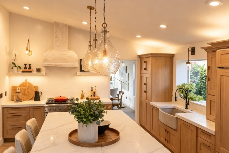
Drawing on interior color theory and numerous completed project cases, premium countertop color schemes are categorized into timeless neutrals, low-contrast harmonious high-end shades, contrast tones for accentuated depth, and natural gradient grain combinations. Select the option that best fits your preferences.
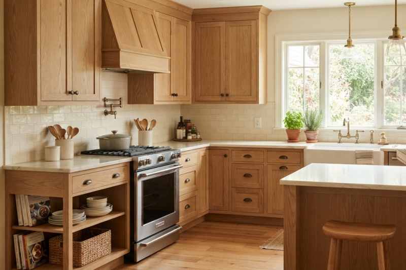
1. Warm White & Cream White: Foolproof Classic Option
Warm white and cream white countertops complement all light wood cabinets and represent the most forgiving pairing solution, as well as a mainstream pick for high-end custom kitchens in recent years. Unlike stark cool white, warm white and cream white carry subtle yellow and beige undertones that perfectly mirror the natural warmth of light wood, preserving the bright, airy quality of light-toned kitchens to the fullest. Options include cream quartz with faint light veining and warm white quartzite. For luxury applications, cream marble with pale gold and beige veins is ideal. Avoid blue-undertone pure white quartz and high-gloss cool white stone, which create harsh color breaks against light wood.
2. Soft Taupe: Low-Saturation High-End Harmonious Shade
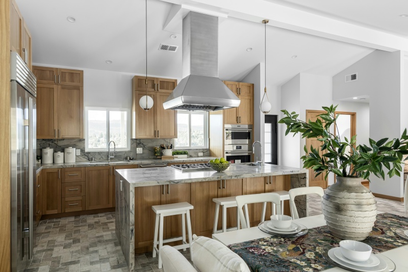
Soft taupe is a neutral hue between white and grey with moderate saturation and inherent earthy texture. Compared with white countertops, its tone sits closer to the natural color of light wood. This pairing avoids the plainness of white combinations and creates a warm, grounded natural atmosphere, making it a favorite for transitional-style kitchens. Choose taupe quartz with uniform fine grain or granite dotted with tiny light brown specks. Matte or fine honed surface finishes are recommended to match the matte texture of light wood.
3. Greige: Sophisticated Modern Minimalist Pairing
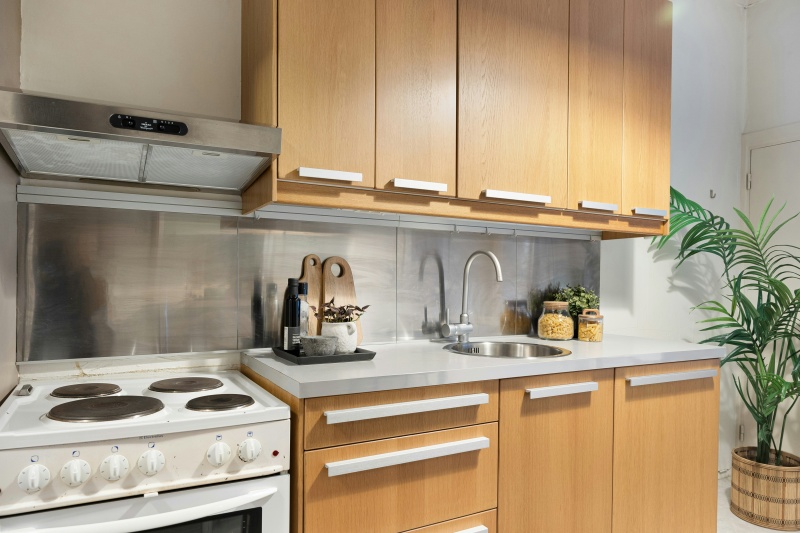
Greige is a blend of grey and beige, perfectly suited for modern minimalist kitchen designs. Distinct from cool grey with blue undertones, warm greige carries faint beige-yellow bases that balance the warmth of light wood and the coolness of modern spaces, resolving the drawbacks of overly cold solid grey countertops and overly plain pure white countertops. Recommended materials: greige quartz with fine light grey veins, low-saturation light grey base quartz with beige veining. Avoid deep cool grey stone with strong blue undertones, which conflict with the warm character of light wood.
4. Dark Accent Colors (Black & Dark Grey)
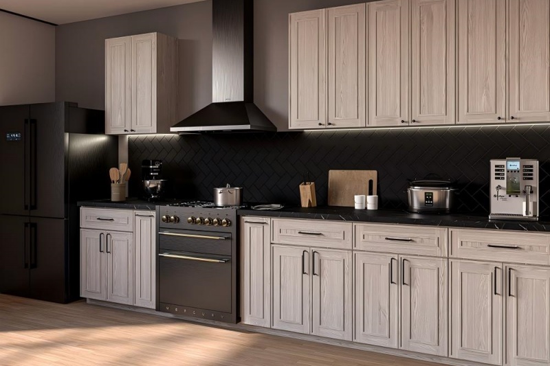
For bold spatial depth and custom styling, matte black, dark grey and charcoal countertops are excellent alternatives. Dark countertops create striking light-dark contrast against light wood cabinetry, instantly enhancing spatial dimensionality and making the soft, airy light wood cabinets stand out. Options include matte black quartz, charcoal granite with subtle white veins, and honed dark grey quartz. High-gloss solid black stone is strongly discouraged, as it readily shows watermarks and dust. Its extreme contrast also undermines the natural texture of light wood.
5. Natural Veined Stone: Premium Custom Texture Solution
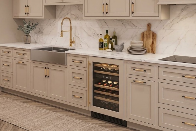
Beyond solid countertops, natural stone with delicate veining (gold, beige, pale grey) is a popular high-end pairing option. Featuring white or cream bases with subtle irregular natural veins, it retains the countertop’s soft airiness while adding unique textural variation to the space. Recommended materials: white marble with fine gold veins, cream quartz with faint beige grain, warm white quartz with light grey veining. Avoid stone with heavy, wide, high-contrast veining, as busy patterns overpower the delicate grain of light wood.
Pairing Pitfalls: Avoid Common Design Mistakes
Based on color theory and completed project experience, three frequent countertop pairing errors for light wood cabinets are summarized below and should be avoided in design:
Pairing Summary & Practical Tips
The core principles for matching countertops with light wood cabinets: consistent base tones, moderate contrast and coordinated texture. To answer what color countertops look best with light wood cabinets: warm white, cream white and beige countertops are the most reliable, durable and versatile choices for most households, compatible with 90% of light wood cabinet kitchens and all space sizes. Choose warm grey or greige schemes for a modern aesthetic; matte dark grey and understated black countertops are preferred for bold depth and individuality.
When shopping, bring physical samples of your light wood cabinetry to compare against countertop materials on-site. Examine color performance under both natural daylight and indoor lighting to mitigate color difference caused by lighting. Select the optimal countertop color scheme according to kitchen area, lighting conditions and personal style preferences, and build a warm, high-end and enduring kitchen.


 Newsletter
 Español

 IPv6 network supported