
What Are You Looking For?
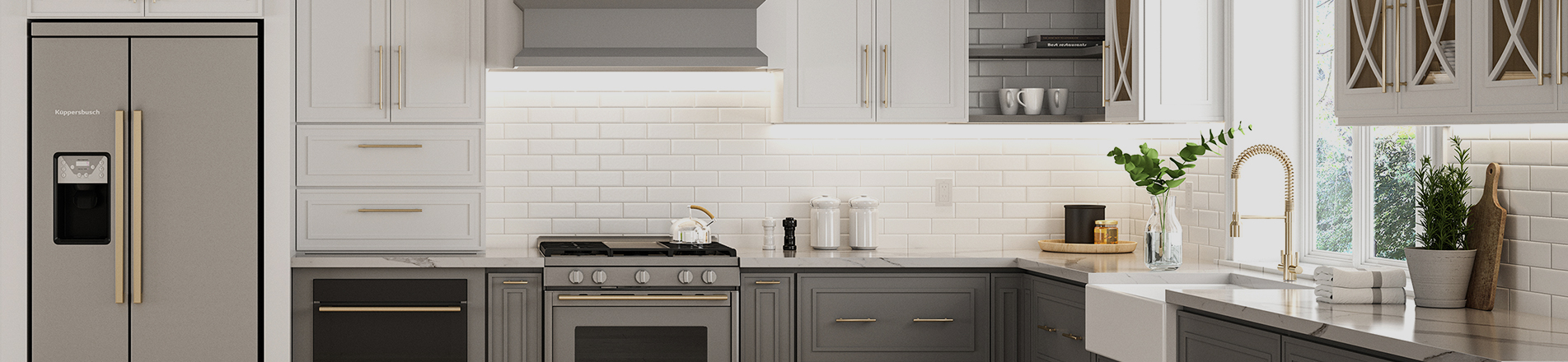
In modern kitchen design, two‑tone cabinets have evolved from a trendy decorative trick into a timeless, structural design strategy. Compared with plain single‑tone cabinetry, two‑tone designs enhance visual appeal through varied color layers, adjust light distribution and create highly personalized spaces. According to interior‑design color theory, two‑tone kitchen cabinets should follow principles such as “light on top, dark below” and “plain upper sections, textured lower sections”. These rules align with human visual ergonomics, prevent the top‑heavy visual effect, and greatly boost the three‑dimensional depth of a kitchen.
As design trends evolve, two‑tone kitchen cabinet palettes have moved away from bold high‑contrast clashing colours toward low‑saturation sophisticated tones, neutral‑colour gradients and natural‑texture integration. Today’s popular combinations include warm‑white wall cabinets paired with wood‑tone base cabinets / kitchen islands, pure‑white wall cabinets with navy‑blue base cabinets, and light‑grey wall cabinets with charcoal‑grey base cabinets.
Design Principles for Two‑Tone Kitchen Cabinet Colour Schemes
Before exploring what are popular color combinations for two‑tone kitchen cabinets, it is critical to understand core design rules. These guidelines prevent clashing colours and tack‑looking finishes, and underpin all premium timeless colour schemes.
1. Balance Visual Weight
Human eyes are more sensitive to dark and high‑saturation hues, which create a visual sense of weight and grounding. By contrast, light, low‑saturation colours feel airy and expansive. The most proven universal rule is light on top, dark below: light‑coloured wall cabinets with dark‑coloured base cabinets. This grounds the lower zone visually and avoids a hollow, insubstantial feel. Meanwhile, light wall cabinets visually stretch vertical space, making small kitchens airier and large kitchens more layered.
The reverse layout (dark on top, light below) has major limitations. It only works for extra‑large kitchens with exceptional natural light; otherwise it creates oppressive visual weight.
2. Consistent Colour Temperature
A well‑executed two‑tone palette is not simply two colours stacked together. It is a harmonious blend with unified colour temperature and differentiated lightness / saturation. Even contrasting colour pairs must belong to either warm‑toned or cool‑toned families.
For example, warm‑white pairs beautifully with warm wood tones; cool‑grey works well with cool navy blue. Mixing cool‑white with warm wood results in jarring dissonance. Never arbitrarily cross warm and cool families. Consistent temperature preserves overall kitchen harmony and avoids chaotic visuals.
3. Coordinated Material & Texture
The final colour appearance heavily depends on cabinet surface finishes. One single colour reads completely different under matte, satin or high‑gloss treatments. Two‑tone schemes need matched colour‑and‑texture logic. Upper and lower cabinet finishes should align to avoid disjointed aesthetics.
Classic Popular Two‑Tone Cabinet Combinations
For long‑lasting appeal, classic colourways are ideal. Proven over decades of shifting trends, they remain widely popular and timeless. Mixed‑color wood kitchen cabinets with two tones are the top pick for most households during interior renovation.
1. Warm‑White Wall Cabinets + Wood‑Tone Base Cabinets / Island
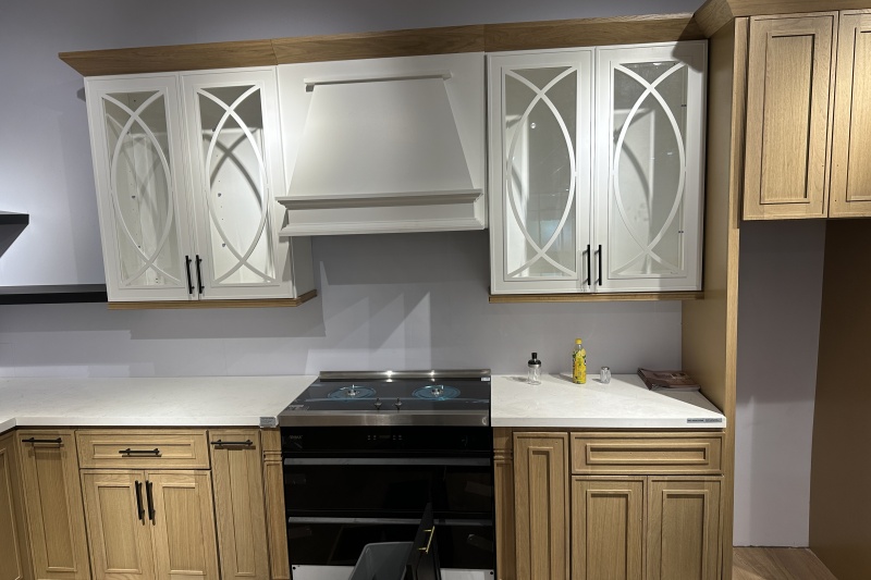
Two‑tone kitchen cabinets brown and white represent the most prevalent, durable two‑tone formula in global kitchen design. It strikes an optimal balance between brightness and homely warmth. Warm white (off‑white, cream white) avoids the harsh coldness of pure white while retaining airy lightness. Brown / natural wood brings organic grain and warm texture. Used for base cabinets or islands, it delivers the ideal light‑upper‑heavy‑lower visual balance.
Spatially, warm‑white wall cabinets maximise reflection of natural and artificial light, solving poor illumination in small‑to‑medium kitchens. Wood‑tone base cabinets or islands infuse hard‑edged kitchens with organic warmth, avoiding the coldness of all‑white kitchens and the heaviness of all‑wood cabinetry. This versatile transitional style fits modern minimalist, Nordic, light American, cottage and other mainstream interior themes.
2. Pure‑White Wall Cabinets + Navy‑Blue Base Cabinets
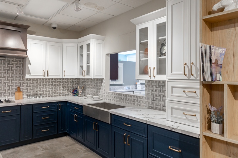
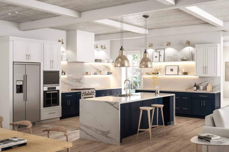
A benchmark for upscale neutral contrast, white‑and‑navy two‑tone cabinets are widely favoured in high‑end interior design. Navy blue is a low‑saturation cool dark shade, conveying stability and sophistication without the gaudiness of bright blue or the oppression of solid black. Pure‑white wall cabinets build a bright open upper zone; navy‑blue base cabinets anchor the overall scheme, creating a calm, elegant, lightly‑luxury kitchen atmosphere.
This versatile solution suits modern minimalist, light‑luxury, Mediterranean and transitional aesthetics, and works for both small and large spaces. In small kitchens, white brightens the room while navy adds depth without claustrophobia. In large kitchens, navy counteracts emptiness and elevates overall refinement.
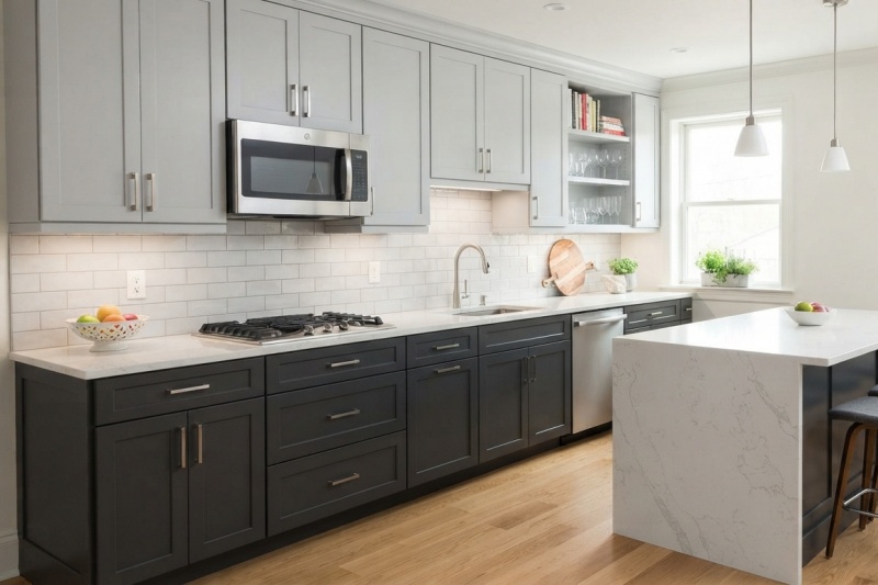
3. Light‑Grey Wall Cabinets + Charcoal‑Grey Base Cabinets
For homeowners favouring understated sophistication and pure minimalism, monochromatic grey‑gradient two‑tone schemes are excellent. Depth comes from value differences within one colour family, without jarring colour clashes, achieving subtle upscale visual shifts — a typical “quiet luxury” design.
Low‑saturation light‑grey wall cabinets keep ceiling zones open and unconfined. Charcoal‑grey base cabinets deepen spatial layers. Grey is inherently neutral; matte finishes enhance premium appeal and pair well with most countertops, floor tiles and interior styles. Compared with two‑tone grey and white kitchen cabinets, grey‑gradient palettes feel softer and more cohesive with less visual segmentation. They reduce eye fatigue and perform excellently for long‑term residential use.
2026 Trending Two‑Tone Cabinet Colours
Driven by the booming biophilic‑design trend, nature‑inspired earth‑toned two‑tone kitchen cabinets have become favourites among younger homeowners. Drawing hues from natural vegetation and earth pigments, these low‑saturation, soft palettes create relaxed, calming kitchens and move away from cold industrial aesthetics.
1. Cream‑White Wall Cabinets + Sage‑Green Base Cabinets
Sage green is a breakout cabinet colour in recent years. Cream‑white plus sage‑green has become the signature palette for nature‑themed kitchens. Sage green carries a muted grey undertone instead of loud, cheap bright‑green saturation; it feels gentle, refined and organically vibrant. Cream white is softer than stark pure white and harmonises perfectly with sage green’s earthy character for unified gentle tones.
Visually, this combination softens hard hardware lines and brings biophilic atmosphere, delivering soothing visuals. It suits Nordic, cottage and fresh‑style interiors and pairs wonderfully with wooden furniture and plant‑based soft furnishings.
2. Warm‑White Wall Cabinets + Dark‑Green Base Cabinets
Dark green is a sophisticated cabinet colour. Paired with warm‑white wall cabinets, it forms a classic natural‑themed contrast. Dark green delivers strong colour presence and natural texture, instantly boosting kitchen fashion sense. Warm white offsets dark green’s visual weight, combining depth and airiness.
This palette suits well‑lit medium‑to‑large kitchens. It matches vintage, light‑luxury and rustic styles. Brass hardware and marble countertops complete a premium kitchen look.
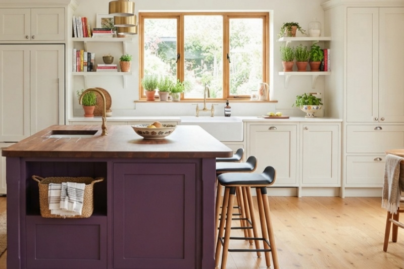
3. Off‑White Wall Cabinets + Grape‑Purple Tall Cabinets / Kitchen Island
Grape purple is soft and non‑glaring, blending nostalgic charm and modern artistic flair. Full‑cabinet application creates light‑luxury elegance; partial accent use (on tall cabinets or islands) lifts the space. It fits vintage and light‑French‑style kitchens with inherent graceful character. Teamed with neutral off‑white as the main tone, it preserves purple’s individuality while muting its cool undertones for enduring visual appeal.
Bold High‑End Two‑Tone Cabinet Palettes
For homeowners pursuing customised individuality and advanced design aesthetics, bold contrasting schemes can break conventional boundaries for one‑of‑a‑kind kitchens. These palettes demand ample natural light and sufficient square footage, and must follow design principles to avoid disappointing outcomes.
1. Pure‑White Wall Cabinets + Solid‑Black Base Cabinets
Black‑and‑white two‑tone is the ultimate expression of minimalist aesthetics. Strong colour contrast sharpens kitchen spatial depth. Pure‑white wall cabinets expand brightness; solid‑black base cabinets anchor the room. Clean lines deliver a crisp, robust, sophisticated modern feel.
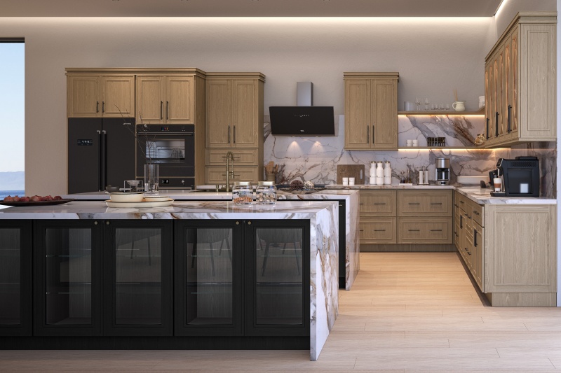
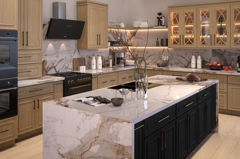
2. Oak Main Cabinets + Black‑Oak Island
The interplay of black and natural wood merges modern coolness with organic warmth, ranking among 2026’s premium trending colour schemes. Black‑oak retains natural wood grain to create contemporary upscale ambience, while natural wood offsets black’s coldness and injects homely warmth.
Two‑Tone Cabinet Design Tips & Pitfalls to Avoid
1. Match Spatial Layout
For open‑plan kitchens, prioritise low‑contrast two‑tone combinations: wood‑and‑pure‑white or grey‑gradient schemes. These maintain consistent whole‑house colour flow and prevent jarring colour jumps that disrupt overall interior harmony.
Closed standalone kitchens can safely adopt high‑contrast options such as black‑and‑white or dark‑green‑and‑pure‑white to strengthen kitchen‑specific design character.
2. Match Lighting Conditions
Kitchens with limited natural light should favour warm‑toned light‑colour combinations and avoid large dark‑coloured surfaces. Bright, well‑lit kitchens can confidently use dark‑hued two‑tone schemes such as navy or black to enrich spatial depth.
3. General Avoidance Rules
Conclusion
Two‑tone cabinets gain popularity thanks to their flexible adaptability and rich three‑dimensional layering. Timeless white‑and‑wood or white‑and‑navy combinations suit households seeking safe, long‑lived aesthetics. White, as a versatile neutral, harmonises with nearly any accent colour.
Soft sage‑green‑and‑cream‑white appeals to lovers of calming nature‑oriented styles. Bolder high‑end schemes such as black‑and‑white or black‑and‑wood fulfil demands for highly personalised dream kitchens.
Great two‑tone cabinet colour schemes are never blind stacks of viral internet colours. They are thoughtful selections based on kitchen size, lighting, whole‑home interior theme and personal taste. Adhere to the three core principles: visual‑weight balance, consistent colour temperature and coordinated texture, and you will achieve a stylish, practical and enduring high‑quality kitchen.


 Newsletter
 Español
 IPv6 network supported